.svg "logo (2)")
"And there it is — the flip."
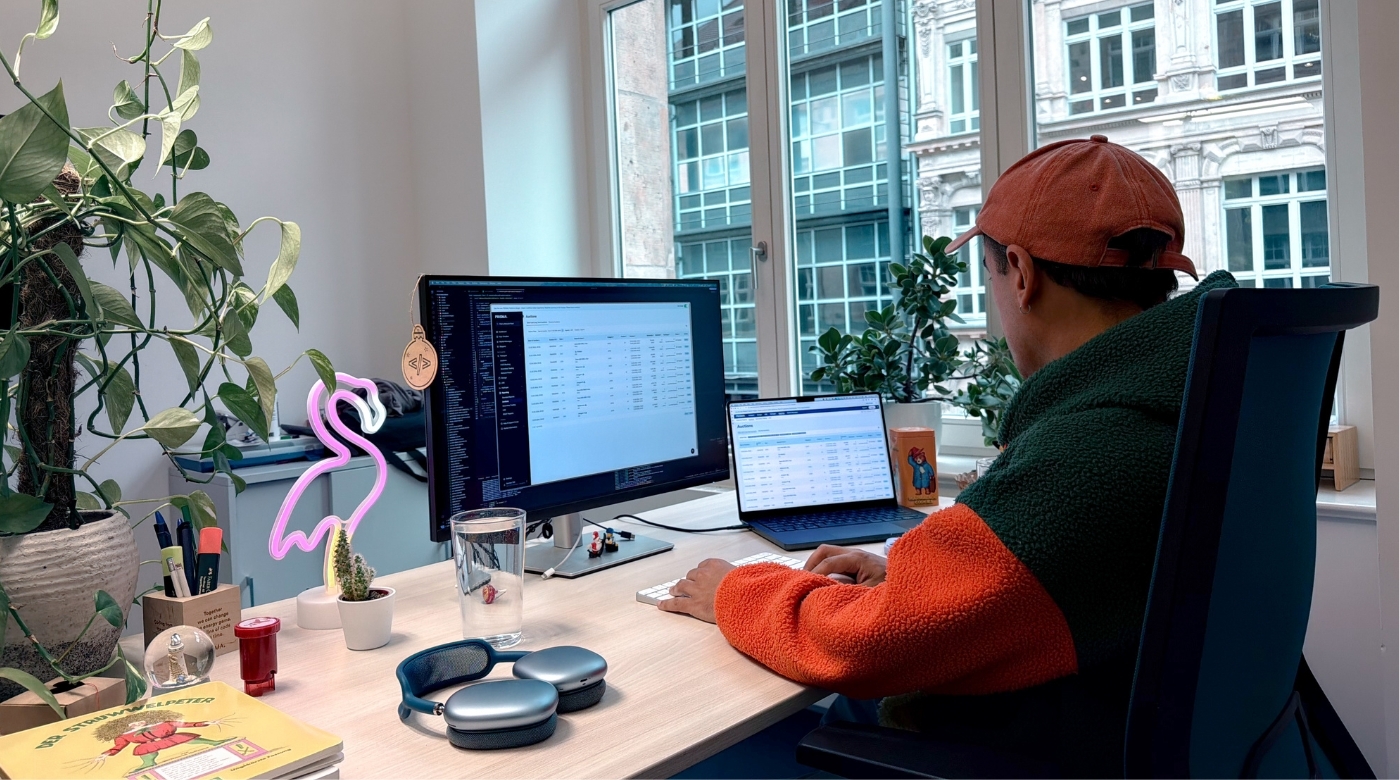
Juan Pablo clicks a toggle and the menu of the PRISMA platform moves from the top of the screen to the side. "That's obviously the biggest change," he says, "but there are way more subtle ones."
Juan Pablo is a Frontend Developer at PRISMA and one of the people behind the platform's Design Relaunch. He scrolls through the icon library, the new color palette, pointing out details that took months to get right. "In so many ways, it's better for the user." He pauses. "Once you see it, you can't unseen it."
Catching Up Visually
"Imagine, we started with this already six years ago!" Juan Pablo holds his hands up, illustrating the sheer time span.

The main reason? The need for space. The PRISMA platform grew — new products, new features — and eventually, the existing navigation started showing its limits. There simply wasn't enough space to organize everything properly anymore. It became clear that the team needed to rethink not just the visuals, but the structure of the interface itself.
Form Follows Function
Building a Shared Dictionary
"We decided to work with Design Tokens," Juan Pablo explains, opening up the shared repository where the entire design system lives. He scrolls through color palettes, typography scales, spacing values. "Think of it like having a shared dictionary of design values," he adds. "If a color changes, you update it in one place, and everything that depends on it follows."
All tokens live in that shared repository, synchronized between Figma and the codebase via a tool called Style Dictionary. This means designers and developers are always working from the same source of truth — and when something changes in design, it flows through automatically.
The same token can become a CSS variable for React, a LESS variable for AngularJS, or a JavaScript object for Storybook — whatever format each part of the platform needs.

"This makes the system future-proof," Juan Pablo adds. "If we expand to other platforms, the same token just transforms into whatever format is needed."

Two Designs, One Platform

With the foundation in place, the team moved to implementation — but that came with some hurdles. "We run critical infrastructure," Juan Pablo says.
"We cannot just flip a switch and expect people to deal with the new design. Users need time to adapt." That's why the new design was introduced as an opt-in experience, with a transition period of several months. Users could switch between the old and new versions, giving them time to adapt while also giving the team room to collect feedback and iterate.
It also meant caring for two designs at the same time — both had to remain usable and functional in parallel. The solution: a toggle in the upper right corner of the screen.
"Think about it like switching between light mode and dark mode on your devices", Juan Pablo says. "But in this case between legacy mode and new mode."
Under the hood, most components were shared but styled differently depending on the active theme. This approach also came with a technical migration: the team needed to move away from Styled Components, which was being sunsetted, and after evaluating options — including running pilots with Panda CSS — they landed on Tailwind CSS.
"It wasn't always straightforward," Juan Pablo acknowledges with a smile. "Some parts of the platform required special handling and not everything could be cleanly abstracted. But overall it allowed us to fully migrate away from Styled Components while keeping the platform stable during the transition."
The Finish Line in Sight
In May 2026, the transition period is slowly reaching its final phase. The legacy design is being phased out — and with it, a significant amount of complexity disappears from the codebase.
That will be a great success for the team. "And a great relief," Juan Pablo adds with a chuckle. "Maintaining two parallel visual systems has been quite demanding. Simplifying down to a single, consistent design system will make a big difference moving forward."
"And it worked out really well," he adds. Juan Pablo scrolls through the platform once more — new design switched on. He smiles. "That's really a good foundation, you know? Now we are ready to scale up even more.